漢字の感じ方。
2011年 TOKYO FOOD MUSEUM New York 企画案
A New Way of Seeing Kanji.
2011 TOKYO FOOD MUSEUM New York — Concept Proposal
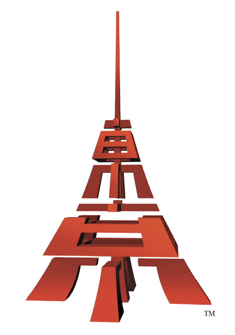
漢字は、一文字の中に意味と歴史を持ちながら、形そのものにも独自の美しさがあります。線の長さや太さ、余白、文字を構成する各部分の関係によって印象が変わり、意味を超えて視覚的な造形として捉えることができます。
この作品は、ニューヨークで日本の食文化を紹介する「TOKYO FOOD MUSEUM New York」の企画案として制作したロゴです。現在では東京を象徴するモチーフとしてスカイツリーがありますが、当時は赤い東京タワーが代表的なランドマークでした。そこで「東京」という二つの漢字を立体的に組み合わせることで、空へ向かって真っすぐに伸びるタワーの姿を表現しています。
漢字を単に配置するのではなく、文字を一度分解し、それぞれの線や形を建築物のように再構成しました。見る位置によって文字の形と立体的な奥行きが重なり、漢字でありながら一つの建造物にも見える造形を目指しています。
Every kanji carries meaning and history within a single character, while its form possesses a distinctive beauty of its own. The length and weight of each stroke, the surrounding space and the relationships among the character’s components all shape its impression, allowing it to be seen as a visual form beyond its literal meaning.
This logo was created as a concept proposal for TOKYO FOOD MUSEUM New York, a project intended to introduce Japanese food culture in New York. Today, Tokyo Skytree is also recognised as a symbol of the city, but at the time the red Tokyo Tower was its defining landmark. By combining the two kanji characters for Tokyo into a three-dimensional structure, I expressed a tower rising straight toward the sky.
Rather than simply arranging the characters, I first took them apart and then reconstructed their strokes and shapes like architectural components. Depending on the viewing angle, the character forms overlap with a sense of depth, creating an image that is both kanji and a structure in its own right.
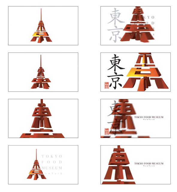
「東」と「京」は、誰もが知る都市名を構成する文字です。しかし、意味から少し距離を置いて形として見つめ直すと、そこには直線や曲線、面と空間がつくり出す新しい表情が現れます。日常的に使っている文字の中に、まだ気づいていない造形の可能性があることを、この作品を通して伝えたいと考えました。
アルファベットとは異なる複雑な構造を持つ漢字は、言葉を伝える記号であると同時に、世界に通じる視覚表現にもなります。文字が持つ意味と形を再発見し、そこから新しいイメージを生み出すこと。それが私にとっての「漢字の感じ方」です。
Art Direction / Design: Toshihiro Onimaru
Creative Direction: Takanori Aiba
Design Firm: GRAPHICS & DESIGNING INC.
“East” and “Capital,” the two kanji that form the name Tokyo, are familiar to everyone. Yet when we step back from their meaning and look at them purely as shapes, new expressions emerge through their straight and curved lines, surfaces and spaces. Through this work, I wanted to reveal the visual possibilities still waiting to be discovered within the characters we use every day.
With a complex structure unlike that of the Latin alphabet, kanji are not only symbols for communicating language; they can also become a visual expression understood across cultures. Rediscovering the meaning and form held within a character, and creating a new image from it—this is what “a new way of seeing kanji” means to me.
Art Direction / Design: Toshihiro Onimaru
Creative Direction: Takanori Aiba
Design Firm: GRAPHICS & DESIGNING INC.