お酒の輝き。
2015年 大関 ワンカップ(オー)
The Radiance of Sake.
2015 ONE CUP〈O:〉

私は2015年、大関株式会社の「ワンカップ(オー)」のパッケージデザインを手がけました。ワンカップ(オー)は、新しい世代に向けて開発された、華やかな香りと軽やかな口当たりが特徴の日本酒です。アルコール分を通常の日本酒より低い12%に抑え、大吟醸酒をブレンドすることで、飲みやすさの中に日本酒らしい香りを感じられる酒質に仕上げられました。「ワンカップ大関」は、手軽さと親しみやすさによって長く愛されてきたカップ酒です。その伝統を受け継ぎながら、新しい世代にも日本酒の魅力を伝えることが、ワンカップ(オー)の開発テーマでした。
開発を進める中で、これまでとは異なる新しいコミュニケーションのためには、商品の特徴や考え方をひと目で伝えるシンプルなアイコンが必要だと考え、ワンカップ(オー)を象徴するシンボルマークを設定しました。デザインは、素材をよく観察することから始まります。シンボルの着想は、ガラスのカップに光を当て、斜め上から眺めていたときに生まれました。透明な容器の内側で光を受けた日本酒の液面が美しく輝き、その光景が一つの印のように見えたのです。
シンボルマークは、外側に「ONE」の頭文字である「O」を、内側に「CUP」の頭文字である「C」を重ね、カップの口元と酒の輝きを一つの造形にしています。文字と情景を重ねることで、商品名そのものを象徴する、シンプルで記憶に残るシンボルをつくりました。
In 2015, I designed the packaging for ONE CUP〈O:〉 for Ozeki Corporation. Developed for a new generation, the sake was characterized by a graceful aroma and a light, gentle taste. Its alcohol content was reduced to 12 percent, while a blend of daiginjo sake brought a distinctly Japanese fragrance to its approachable character. ONE CUP OZEKI had long been loved for its convenience and familiarity. The challenge was to carry that heritage forward while communicating the appeal of sake to new drinkers.
As the product was developed, I felt that this new form of communication needed a simple icon capable of conveying its character and concept at a glance. Design begins with close observation of the material itself. The idea for the symbol emerged while I was looking down at a glass cup from an angle as light fell across it. The surface of the sake caught the light and shone within the transparent vessel, appearing almost like a mark in its own right.
The outer form combines the “O” of ONE with the inner “C” of CUP, bringing the rim of the cup and the radiance of the sake together in a single image. By layering language and scene, I created a simple, memorable symbol that embodies the name of the product itself.
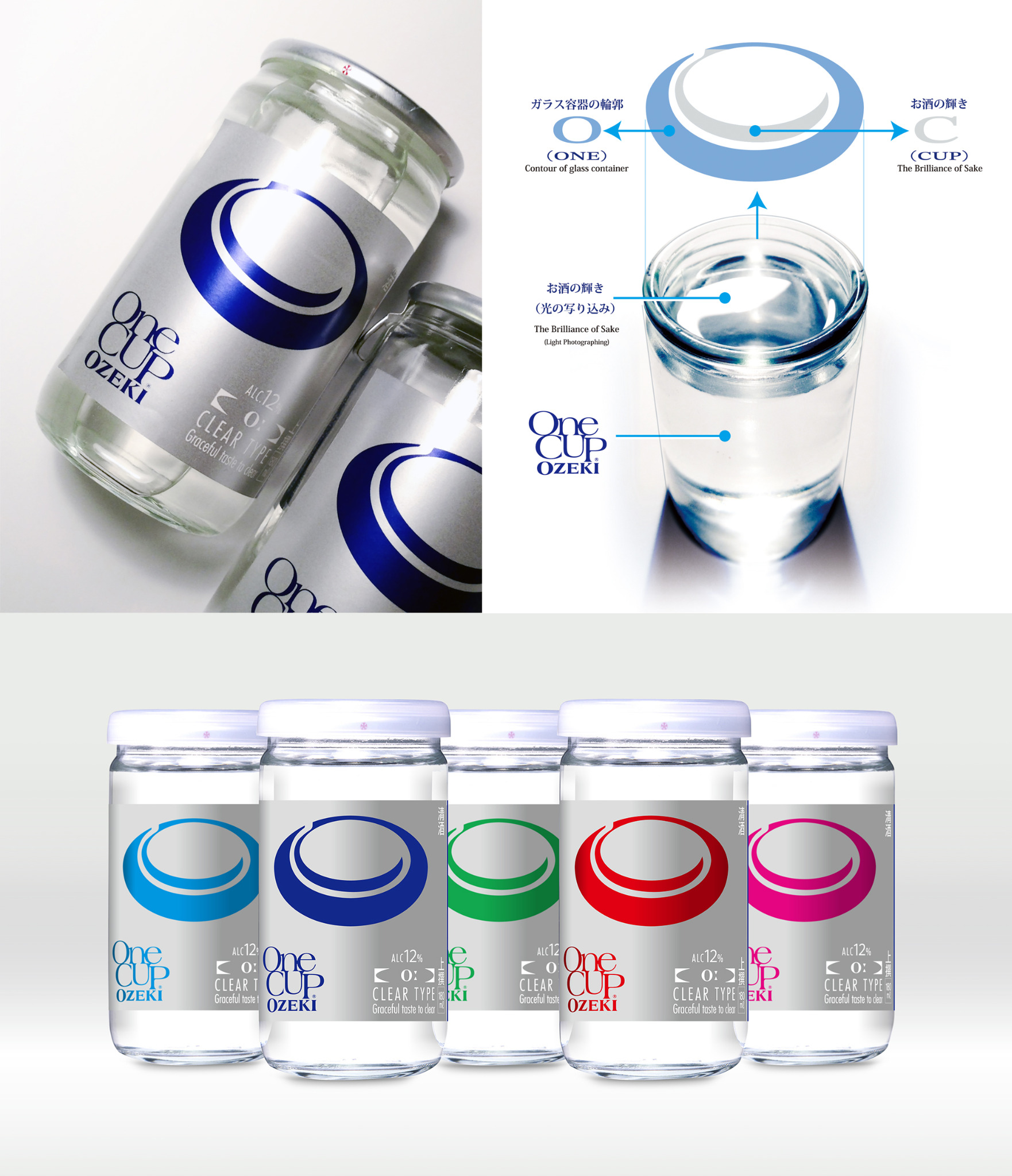
パッケージでは透明な容器と酒の輝きを生かし、シンボルマークを中心に情報を整理しました。基本カラーにはシルバーとブルーを採用し、軽やかな酒質と透明感を、すっきりとした現代的な表情で伝えています。また、キャンペーン商品ではシンボルマークを多彩な色で展開し、売り場に楽しさと新鮮な印象を生み出しました。
身近なものの中にも、まだ見つけられていない魅力があります。ワンカップ(オー)では、誰もが知るガラス容器の中に日本酒の美しい輝きを見つけ、それを新しい世代へ語りかけるブランドの印として表現しました。
2015
Client: Ozeki Corporation
Art Direction / Design: Toshihiro Onimaru
Design Firm: GRAPHICS & DESIGNING INC.
The packaging uses the transparency of the vessel and the radiance of the sake itself, organizing the information around the new symbol. Silver and blue form the core color palette, communicating the light character and clarity of the sake with a clean, contemporary expression. For a promotional edition, the symbol was presented in a range of vivid colors, bringing freshness and visual energy to the retail display.
Even the most familiar objects can hold qualities that have yet to be discovered. For ONE CUP〈O:〉, I found a beautiful radiance within the familiar glass vessel and transformed it into a brand symbol that could speak to a new generation.
2015
Client: Ozeki Corporation
Art Direction / Design: Toshihiro Onimaru
Design Firm: GRAPHICS & DESIGNING INC.