線で、空間とストーリーを描く。
2002年 MANHATTAN DINING
Drawing Space and Story with Lines.
2002 MANHATTAN DINING
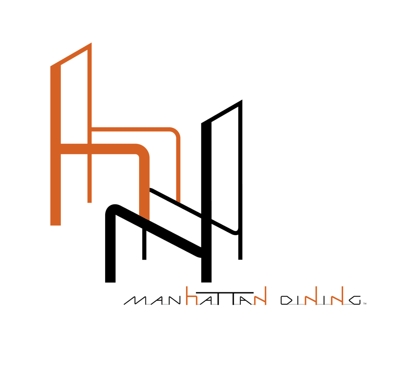
私は2002年、マンハッタンダイニングのロゴとオリジナルタイポグラフィを制作し、ステーショナリー、メニュー、サインへと展開するVIデザインを手がけました。
ロゴの中には、椅子があり、テーブルがあります。マンハッタンダイニングの頭文字である「M」を基本に、椅子とテーブルを一本の線で立体的に構成しました。店名のタイポグラフィも、このロゴを形づくる線の特徴を生かして、一文字ずつオリジナルで設計しています。そこには、人が椅子に座り、テーブルを囲み、料理と会話を楽しむ風景があります。ロゴとタイポグラフィは店名を示すだけの記号ではなく、レストランでこれから生まれる時間や体験を描いた一つのストーリーです。
オレンジはグリルの炎や料理の温かさを、ブラックは都会的な空間と品質を象徴しています。異なる太さの線が交差しながら一つの形をつくることで、料理、人、空間が結びつくレストランの体験を表現しました。
In 2002, I created the logo and original typography for Manhattan Dining and developed the visual identity across stationery, menus and signage.
Within the logo are a chair and a table. Based on the initial “M” of Manhattan Dining, these elements were constructed three-dimensionally through a continuous language of line. The logotype was also drawn letter by letter, using the same linear characteristics as the symbol. It contains the scene of people taking their seats, gathering around a table and sharing food and conversation. The logo and typography are not simply signs identifying the restaurant; together they form a story about the time and experiences that would unfold there.
Orange represents the heat of the grill and the warmth of the food, while black expresses the quality and urban character of the space. Lines of different weights intersect to form a single image, connecting food, people and place within the restaurant experience.
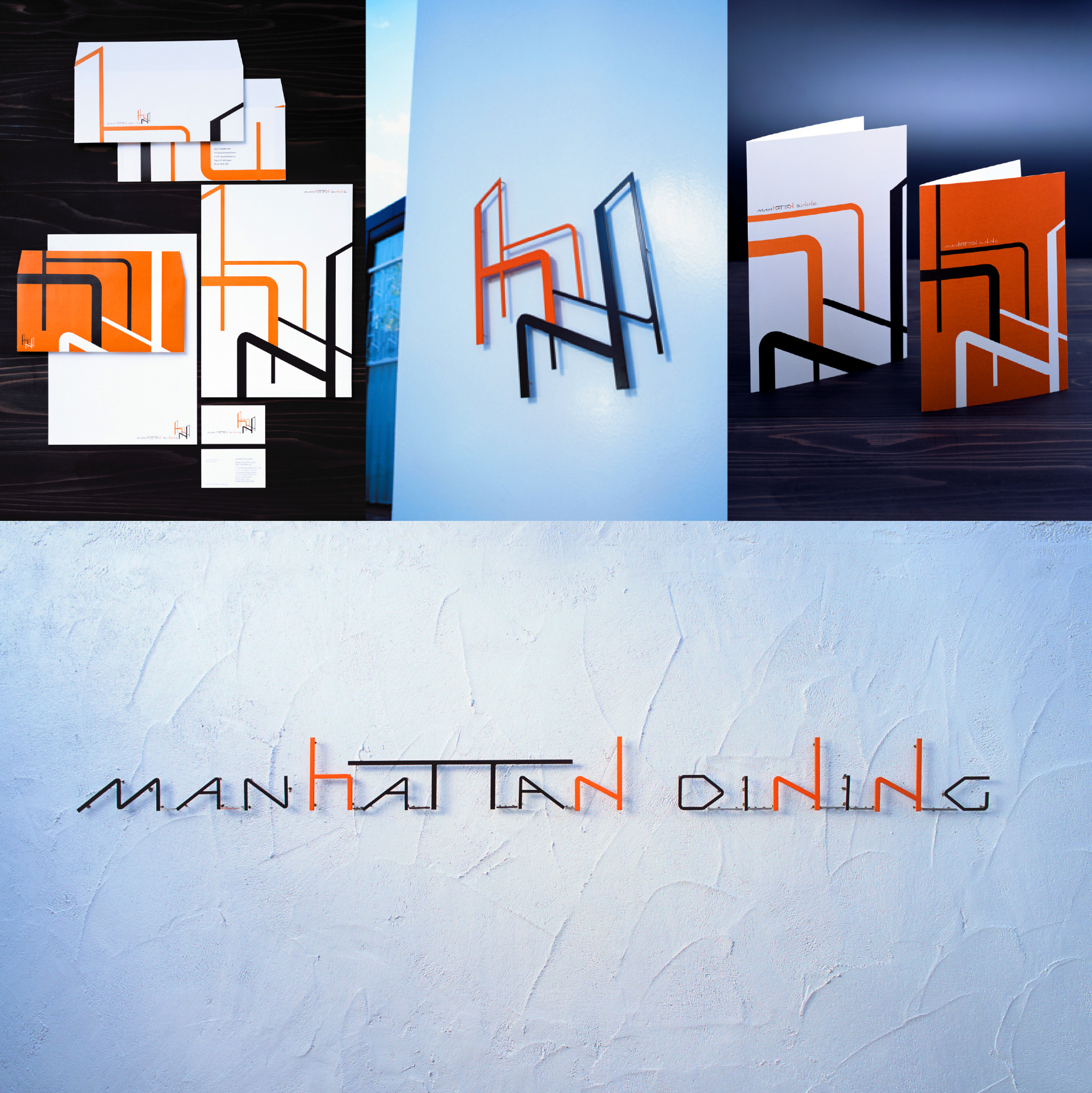
この造形は、ロゴだけで完結するものではありません。ステーショナリーやメニューの表紙へ展開し、壁面では立体的なサインとして空間の中に浮かび上がらせています。小さなカードから大きな壁面まで、同じ線が形を変えながら連続することで、店舗全体に一貫したリズムが生まれました。
レストランで感じるものは、料理の味だけではありません。香り、音、光、手触り、空間の温度、そして人と過ごす時間までが一つの体験になります。色や形を増やさなくても、線の組み合わせによって文字をつくり、空間を生み、人が向かい合う情景まで描くことができます。マンハッタンダイニングでは、一本の線から、空間と体験の物語をつくりました。
※マンハッタンダイニングは、現在営業を終了しています。
Client: Will Planning Co., Ltd.
Logo / Typography / Visual Identity Design: Toshihiro Onimaru
Art Direction: Takanori Aiba
Design Firm: GRAPHICS & DESIGNING INC.
The form does not end with the logo. It extends across stationery and menu covers, while on the wall it appears as a three-dimensional sign floating within the space. From a small card to a large architectural surface, the same lines continue in changing forms and create a consistent rhythm throughout the restaurant.
A restaurant is experienced through more than taste. Scent, sound, light, touch, the temperature of the room and the time spent with others all become part of a single experience. Without adding unnecessary colours or forms, lines can create letters, generate space and depict the scene of people facing one another. At Manhattan Dining, a line became the beginning of a story about space and experience.
Manhattan Dining is no longer in operation.
Client: Will Planning Co., Ltd.
Logo / Typography / Visual Identity Design: Toshihiro Onimaru
Art Direction: Takanori Aiba
Design Firm: GRAPHICS & DESIGNING INC.