一本の線が、活きた時代。
1988年 神戸芸術工科大学
When Every Line Mattered.
1988 KOBE DESIGN UNIVERSITY
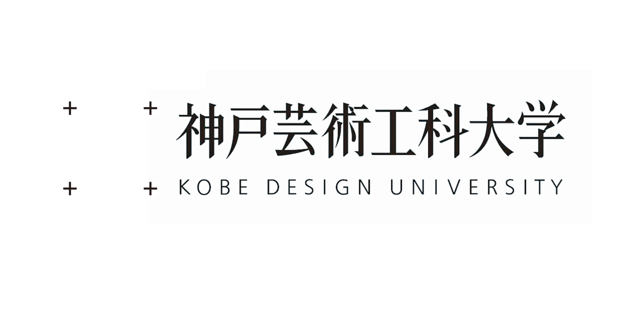
私は1988年、翌1989年4月の開学を控えた神戸芸術工科大学のVIデザインを協力会社として担当しました。手がけたのは、大学名のロゴタイプとシンボルマークをはじめ、デザインガイドラインや大学案内のガイドブックなど、大学の視覚的な基盤を構築する仕事です。このうち大学名のロゴタイプは、アメリカ人デザイナーと共同で制作しました。現在であれば、パソコンの画面上で文字の大きさや線の太さ、文字間のバランスを確認し、必要に応じてすぐに修正できます。しかし当時は、デジタルツールがまだ一般的ではありませんでした。制作は鉛筆による下書きから始まり、製図用の定規と製図ペンのロットリングを使って、一本一本の線を手作業で整えていきました。
ロゴタイプの制作で特に時間をかけたのが「神戸芸術工科大学」という漢字です。漢字一文字を約200ミリの大きさまで拡大し、線の太さや文字内部の空間、隣り合う文字との関係を確認します。文字を裏返して光に透かし、バランスを確かめることも重要な工程でした。修正を何度も繰り返し、真っ白な紙の上で全体の調和を整えていきました。一文字だけを見れば美しくても、大学名として並べたときに違和感が生まれることがあります。個々の文字の完成度だけでなく、複数の漢字が一つの名称として見えたときの流れや重心まで整えなければなりません。制作には、およそ2か月を要しました。現在のデザイン環境と比べれば、非常に多くの時間と手間を必要とする工程です。しかし簡単に元へ戻すことのできない手作業だからこそ、一本の線を引く前に考え、描いた後に立ち止まり、細部まで慎重に判断する時間がありました。
In 1988, as Kobe Design University prepared to open in April 1989, I worked on the university’s visual identity on behalf of a collaborating design company. The work included the university logotype and symbol mark, design guidelines, and a guidebook introducing the university, all of which helped establish its visual foundation. The Japanese logotype was developed in collaboration with an American designer. Today, the size of a letter, the weight of a line and the spacing between characters can be examined and revised immediately on a computer screen. At the time, however, digital tools were not yet in general use. The process began with pencil drawings. Using drafting rulers and Rotring technical pens, we refined each line by hand.
Particular care went into the Japanese characters of “Kobe Design University.” Each character was enlarged to approximately 200 millimetres so that we could examine the line weight, the spaces within the forms and the relationships between neighbouring characters. Turning the drawings over and holding them up to the light was also an important way to judge their balance. We made repeated adjustments, gradually bringing the composition into harmony on a clean sheet of white paper. A character may appear beautiful on its own yet feel subtly wrong when placed within the university’s full name. It was necessary to refine not only each individual form, but also the rhythm and visual centre created when the characters were read as a single name. The work took approximately two months. Compared with today’s design environment, it required an extraordinary amount of time and effort. Yet because the process could not be undone with a simple command, there was time to think before drawing a line, to pause after drawing it and to judge every detail with care.
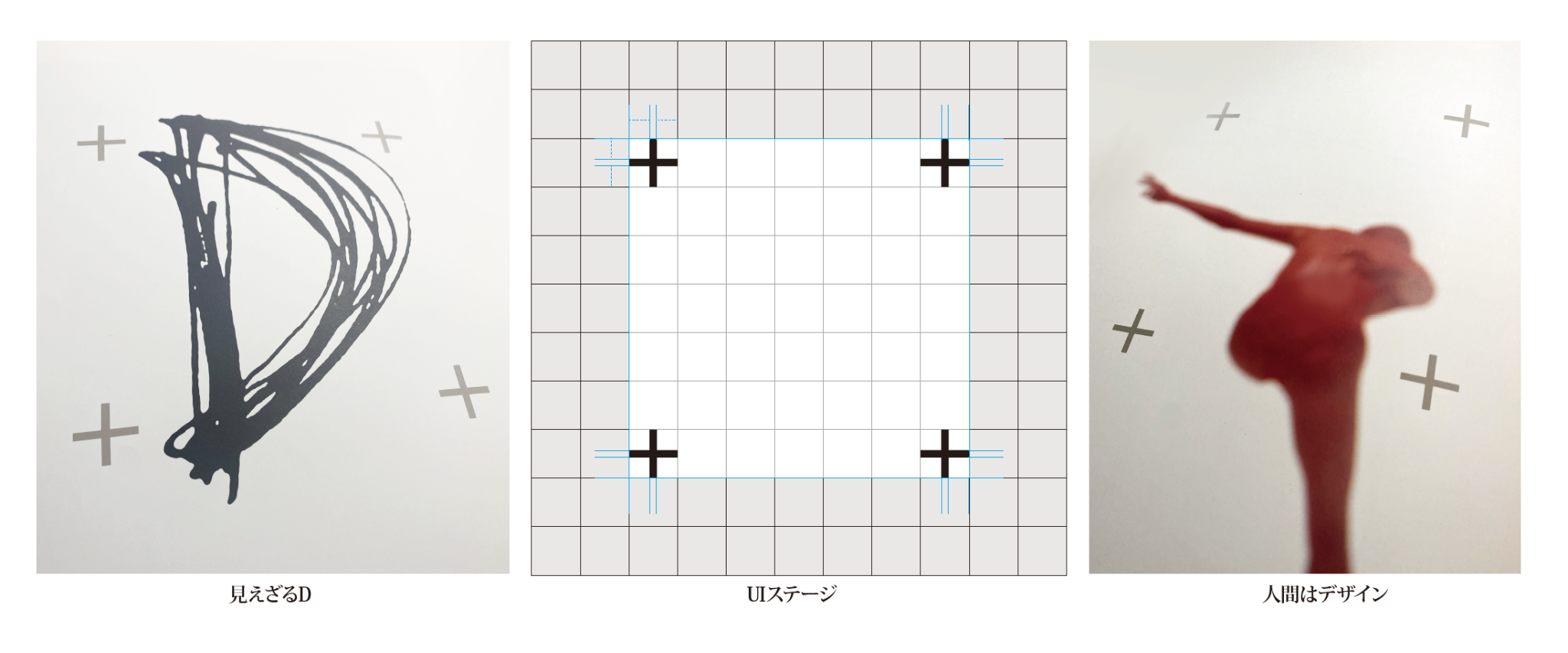
シンボルマークには、極めてシンプルな「+」の造形を採用しています。この「+」は、完成された一つの答えを示すものではありません。神戸芸術工科大学に関わる人々が自由に発想し、それぞれの創造によって新しい価値を加えていく空間を表しています。当初、私は16個の「+」を組み合わせた網目状のデザインを考えていましたが、設立準備室の全体会議を経て、現在のシンプルな案が採用されました。線の太さや全体の大きさ、四隅の位置など、単純な造形だからこそ、わずかな違いが印象を大きく左右します。要素を減らせば簡単になるのではなく、ごまかしが利かなくなる。最小限の形の中にどこまで思想を込められるかを考え、細部にわたって検討を重ねました。
当時は「ブランディング」という言葉が、現在のように使われていた時代ではありません。しかし大学が何を目指し、どのような人を育て、社会にどのような価値を生み出していくのかを考え、それを文字とシンボルによって可視化する仕事は、現在のブランディングデザインと本質的に同じものだったと思います。手で描く時代からデジタルへ、そしてAIと共存する創造の時代へ。制作の方法は大きく変化しました。それでも、何のためにつくるのかを考え、その背景にある理念を理解し、最もふさわしい形を探し続けることは変わりません。神戸芸術工科大学のUIデザインは、思考と手仕事を重ねながら、一つのブランドの基盤を築いた仕事でした。時間をかけて線と文字に向き合った経験は、現在の私のブランディングデザインにもつながっています。
Announced in 1988 / University opened in April 1989
Client: Kobe Design University
Design: Toshihiro Onimaru
Logotype Design: Toshihiro Onimaru with an American Designer
Art Direction: Kobe Design University Preparatory Office / Takanori Aiba
Design Firm: Graphics International Inc.
The symbol mark takes the form of an exceptionally simple plus sign. It does not represent a single, finished answer. Rather, it expresses a space in which everyone connected with Kobe Design University can think freely and add new value through their own creativity. My initial proposal was a mesh-like composition made from sixteen plus signs, but following a full meeting of the preparatory office, the simple form used today was selected. In a form this reduced, the slightest difference in line weight, overall proportion or the position of the four corners can alter the entire impression. Reducing the number of elements does not make a design easier; it leaves nowhere to hide. We examined every detail, asking how much meaning could be carried by the fewest possible forms.
At the time, “branding” was not used as it is today. Yet the task of considering what a university seeks to achieve, the people it hopes to nurture and the value it aims to create for society—and then making those ideas visible through letters and a symbol—was essentially the same as what we now call branding design. From drawing by hand to digital production, and now to an age of creativity shared with AI, the methods of making have changed dramatically. What has not changed is the need to ask why something is being created, to understand the ideas behind it and to continue searching for the most appropriate form. The visual identity of Kobe Design University was a project that built the foundation of a brand through thought and craftsmanship. The experience of spending time with every line and every letter continues to inform my approach to branding design today.
Announced in 1988 / University opened in April 1989
Client: Kobe Design University
Design: Toshihiro Onimaru
Logotype Design: Toshihiro Onimaru with an American Designer
Art Direction: Kobe Design University Preparatory Office / Takanori Aiba
Design Firm: Graphics International Inc.