伝統をつくる新しいシンボル。
2009年 船橋屋ブランドマーク
A New Symbol That Carries Tradition Forward.
2009 FUNABASHIYA BRAND MARK

東京・亀戸の船橋屋は、文化二年(1805年)の創業以来、二百年以上にわたりくず餅をつくり続けてきた、東京を代表する老舗和菓子店です。受け継がれてきた歴史や信頼を大切にしながら、これからの時代にも親しまれるブランドの姿をどのように表現するか。それが、このブランドマークを考える出発点でした。現在では、くず餅の原料となる発酵小麦澱粉を活かしたプリンや、季節のスイーツなど、新しい人気商品も展開しています。伝統の味を守りながら、新しいおいしさや楽しみ方を生み出していく。ブランドマークにも、二百年以上受け継がれてきた伝統と、新しい商品や事業にも広がっていく柔軟さが必要だと考えました。
歴史を強く意識しすぎれば古く見え、現代性を求めすぎれば長い年月を重ねてきたブランドの重みが失われます。船橋屋らしさを残しながら、伝統と現代性の間にある最適なバランスを探りました。シンボルマークは、船橋屋の「ふ」と、くず餅の「く」を組み合わせて構成しています。二つの文字を向かい合わせることで、過去から現在、そして未来へと続く時間の流れと、人と人との結びつきを表現しました。それを亀甲を思わせる六角形で囲み、創業の地である亀戸とのつながりや、長寿と繁栄への願いを込めています。
Founded in Kameido, Tokyo, in 1805, Funabashiya is one of Tokyo’s most distinguished long-established Japanese confectioners, having made kuzumochi for more than two centuries. The starting point for this brand mark was the question of how to honour its inherited history and trust while expressing a presence that would remain familiar in the years ahead.
Today, Funabashiya also offers popular new products, including puddings made with fermented wheat starch—the ingredient used for kuzumochi—and seasonal sweets. While preserving its traditional flavour, it continues to create new tastes and ways to enjoy them. The mark therefore needed both the tradition inherited over two centuries and the flexibility to extend into new products and businesses.
Too much emphasis on history can make a brand appear dated, while too much modernity can diminish the weight of its accumulated years. The design sought the most appropriate balance between tradition and contemporary clarity while preserving the character of Funabashiya.
The symbol combines the Japanese characters “ふ” from Funabashiya and “く” from kuzumochi. By facing the two forms towards one another, it expresses the flow of time from the past through the present and into the future, as well as the relationships connecting people. The form is enclosed within a hexagon recalling a tortoiseshell pattern, linking it to Kameido, the place where the company began, and carrying wishes for longevity and prosperity.
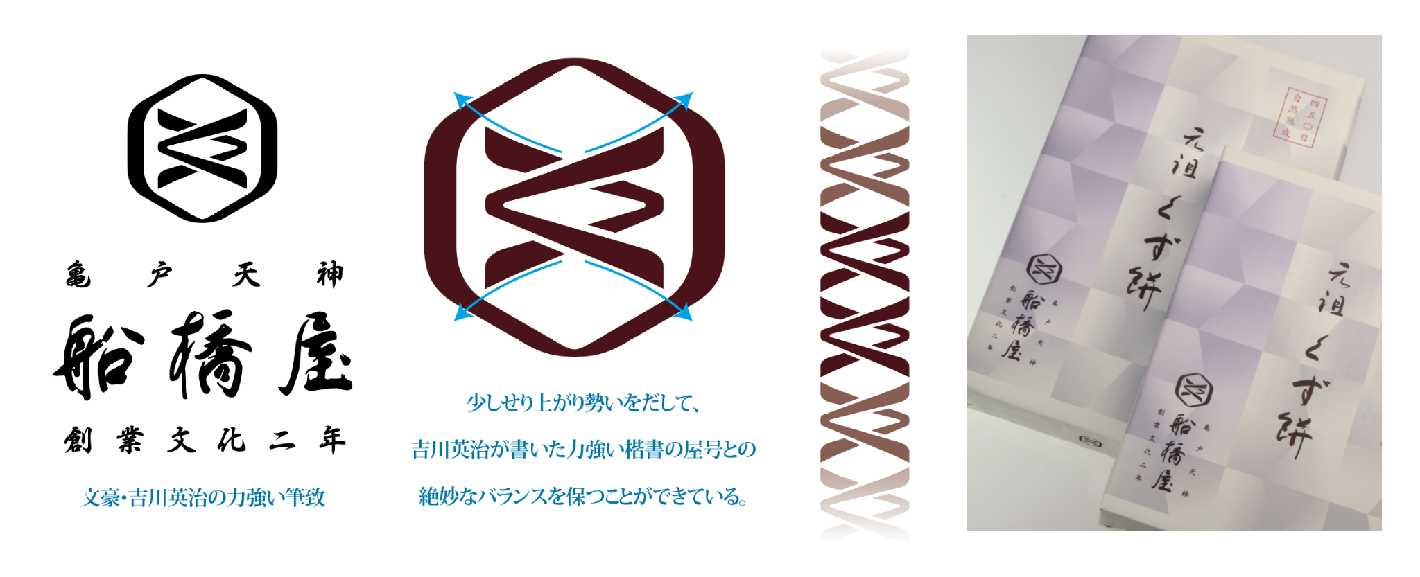
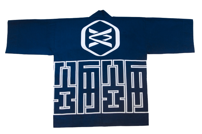

単純な形に見えるシンボルほど、線の太さや曲線の張り、文字と外枠の間に生まれる余白が、全体の印象を大きく左右します。わずかな調整を繰り返しながら、老舗としての品格と、現代のブランドにふさわしい明快さの両立を目指しました。社名の和文ロゴタイプには、文豪・吉川英治による力強い筆文字を使用しています。歴史ある文字と新しいシンボルマークが自然に調和するよう、組み合わせや大きさ、余白を幾度も検討しました。過去をそのまま保存するのではなく、受け継いだ価値を新しい時代へつないでいく船橋屋の姿を表現しています。
ロゴは、企業や商品の名前を示すためだけの印ではありません。長い歴史の中で積み重ねられてきた記憶や信頼を受け止め、これからブランドが向かう方向を示すものでもあります。船橋屋のブランドマークは、守るべき伝統と、新しい商品や事業へ進む意志を一つの形に込めた仕事です。
Client: Funabashiya Co., Ltd.
Art Direction / Design: Toshihiro Onimaru
Design Firm: GRAPHICS & DESIGNING INC.
The simpler a symbol appears, the more its impression depends on the weight of each line, the tension of its curves and the space between the characters and the outer frame. Through repeated refinements, the design sought to combine the dignity of a long-established company with the clarity required of a contemporary brand.
The Japanese logotype uses powerful brush lettering by the novelist Eiji Yoshikawa. Its combination, scale and surrounding space were repeatedly examined so that the historic lettering and the new symbol would sit in natural harmony. Rather than preserving the past unchanged, the identity expresses Funabashiya’s way of carrying inherited value into a new era.
A logo is more than a sign that identifies a company or product. It receives the memories and trust accumulated over a long history while indicating the direction in which the brand will move next. The Funabashiya brand mark brings together the tradition that must be protected and the will to move into new products and businesses in a single form.
Client: Funabashiya Co., Ltd.
Art Direction / Design: Toshihiro Onimaru
Design Firm: GRAPHICS & DESIGNING INC.