職人の「技術」と芸術家の「感性」。
2012年 ARTISAN&ARTIST ブランドマーク
The Artisan’s Craft and the Artist’s Sensibility.
2012 ARTISAN&ARTIST Brand Mark

私は2012年、ARTISAN&ARTIST*(アルティザン&アーティスト)のブランドマークを作成いたしました。アルティザン&アーティストは、メイクアップアーティストやスタイリストなど、プロフェッショナルの厳しい要求に応える道具をつくり続けてきたブランドです。職人の丹念な手仕事と芸術家の感性により生み出された揺るぎないクオリティ。プロにも選ばれているその機能性は、使うほどに配慮の深さを感じさせ、手放せないほどの愛着へと変わってゆきます。長く使われてきたロゴタイプには、すでにブランドとしての信頼と歴史がありました。日本の繊細なものづくりや美意識を、より明快に世界へ伝えていくためには、ロゴタイプだけではない新しい象徴が必要でした。既存のロゴタイプを大切に残しながら、ブランドの考え方をひと目で伝えるブランドマークを加えることが、このリブランディングの出発点でした。
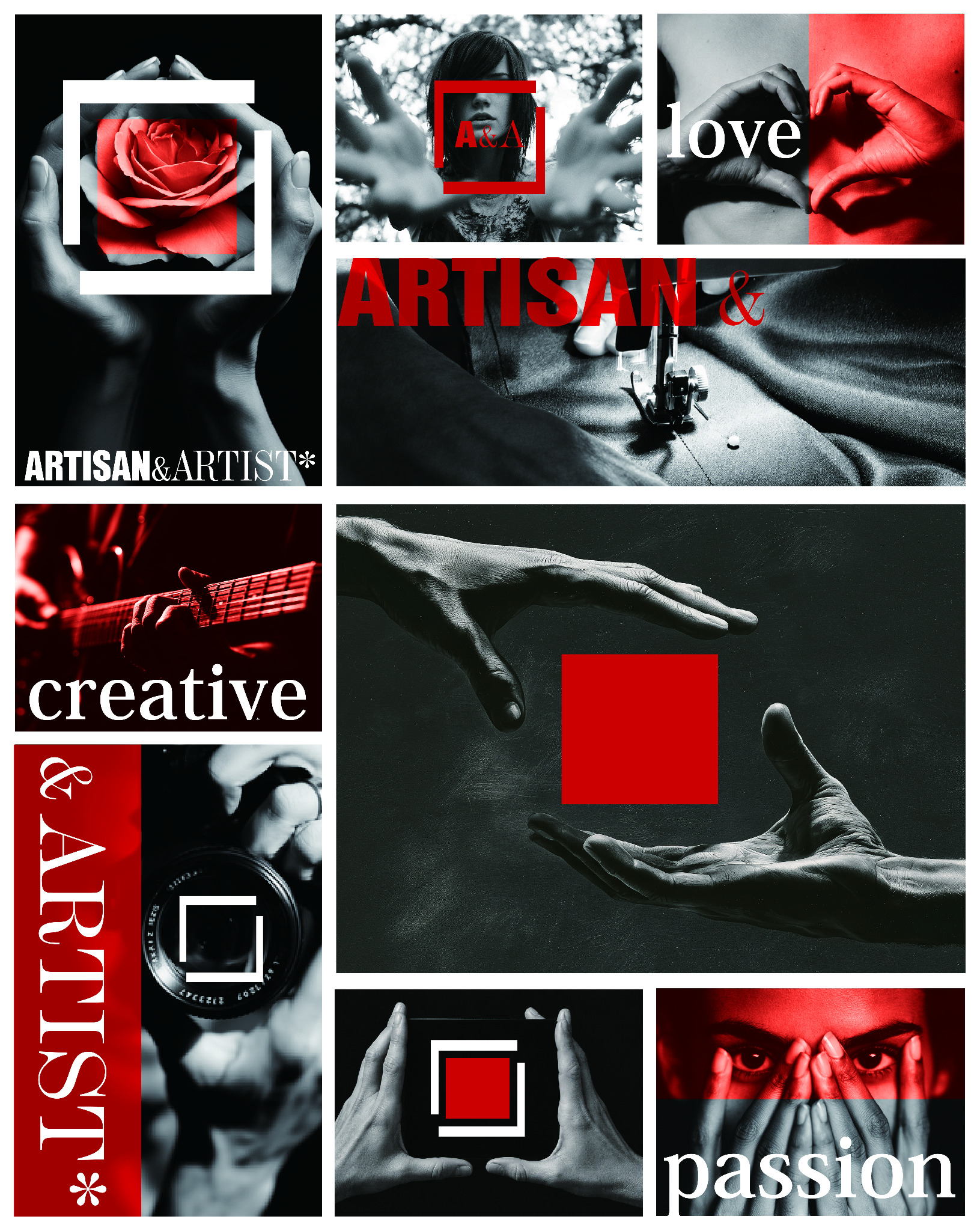
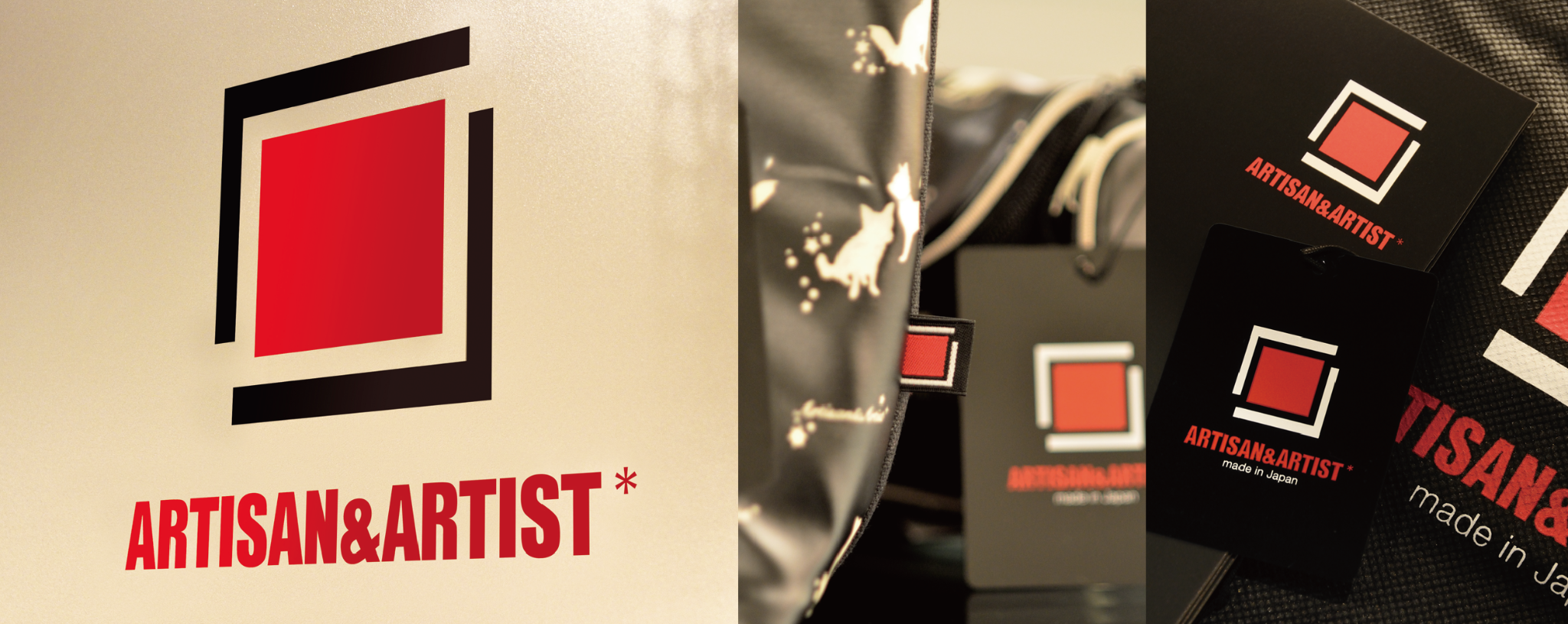
ブランドマークは、中央の赤い四角を、二つのL字を思わせる線が囲む構成です。赤い四角は商品を象徴すると同時に、日本の赤、すなわちMade in Japanの誇りを表しています。その周囲には、製品を生み出す職人の技術の手と、芸術家の創造の手を重ねました。異なる専門性が寄り添い、一つの製品を完成へ導く関係を表現しています。単純な構成だからこそ、四角の大きさ、線の太さ、わずかなずれや余白が、印象を大きく左右します。均整を取りすぎず、少しの緊張感を残すことで、手仕事の確かさとプロフェッショナルの鋭い感覚が伝わる形を目指しました。赤、黒、白という最小限の色彩にも、製品の機能性を妨げず、さまざまな素材や用途に展開できる強さを持たせています。
In 2012, I created the brand mark for ARTISAN&ARTIST*. The brand has long produced tools that meet the exacting demands of professionals, including makeup artists and stylists. Its unwavering quality is born from the meticulous handwork of artisans and the sensibility of artists. Trusted by professionals, its functionality reveals an ever-deeper level of consideration with use, growing into an attachment so strong that the tools become indispensable. The long-established logotype already carried the brand’s history and credibility. Yet to communicate the refinement of Japanese craftsmanship and its aesthetic sensibility more clearly to the world, the brand needed a new symbol beyond the logotype. Preserving the familiar logotype while adding a brand mark that could express the brand’s philosophy at a glance became the starting point for this rebranding.
The brand mark is composed of a red square at its centre, framed by two lines suggestive of the letter L. The red square represents the product itself as well as the red of Japan—a statement of pride in Made in Japan. Around it, I brought together the hands of the artisan who makes the product and the artist who creates with it. It expresses how two distinct forms of expertise come together to bring a single product to completion. Precisely because the composition is so simple, the size of the square, the weight of the lines, subtle shifts and the surrounding space dramatically change its impression. Rather than pursuing perfect symmetry, I retained a slight tension so that the assurance of handcraft and the sharpened instincts of a professional could be felt. The minimal palette of red, black and white also gives the mark the strength to work across diverse materials and applications without interfering with the product’s functionality.

当時、信頼するカメラマンとのロケ先で、黒いカメラバッグを開けた瞬間に、赤い仕切りのインナーに収められたカメラとレンズが覗きました。赤と黒のコントラストが美しく、すぐにアルティザン&アーティストの商品だとわかりました。ブランドマークは外側に表示されるだけではなく、製品の内側にもその存在を感じさせるものだと、あらためて思った印象的な場面です。
ARTISAN&ARTIST*の製品に込められた、職人と芸術家の誇りと自信。このシンボルが、日本のものづくりの美しさとともに世界へ広がり、使う人の手に寄り添いながら、新しい創造の喜びと長く続く愛着へつながっていくことを願っています。
At the time, while on location with a photographer I trusted, I watched him open a black camera bag. Inside, his camera and lenses appeared against vivid red dividers. The contrast of red and black was striking, and I immediately knew the bag was an ARTISAN&ARTIST product. It was a memorable moment that reminded me that a brand mark is not only something displayed on the outside; its presence can also be felt within the product itself.
ARTISAN&ARTIST* products embody the pride and confidence of both artisan and artist. I hope this symbol will carry the beauty of Japanese craftsmanship into the world, staying close to the hands of those who use these tools while inspiring the joy of new creation and a lasting sense of attachment.
2012
Client: ARTISAN&ARTIST Co., Ltd.
Art Direction / Design: Toshihiro Onimaru
Design Production: NOAH COMMUNICATION
Advertising Agency: NIHON KEIZAI ADVERTISING